Inside the 2024 Kips Bay Decorator Show House in NYC
I just got back from the most amazing design event in New York City – the NYC Kips Bay Decorator Show House! This year, the show home at 125 East 65th St. on the Upper East Side did not disappoint as top designers gave each space their unique and creative vision.
From rooms inspired by world travels to hidden hideaways, it was like stepping into a magazine come to life!
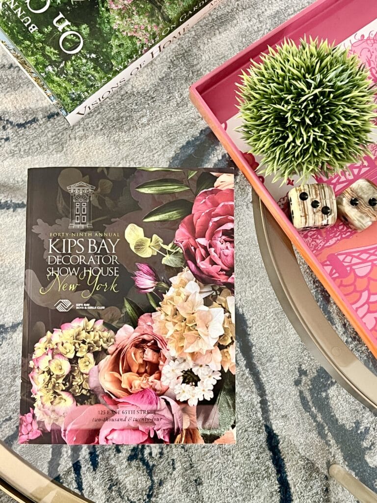
This blog contains affiliate links. This means a small commission is earned if you make a purchase by using this link. The price you pay will be the same whether you use the affiliate link or go directly to the vendor’s website using a non-affiliate link. As an Amazon Influencer, I earn from qualifying purchases.
A Good Time to Be in NYC
The annual Kips Bay Decorator Show House event in New York City has been on my bucket list for years. I finally got the timing right this May when we visited NYC for my daughter, Samantha’s, Manhatten School of Music Masters recital.
Lucky me got to see her recital and take her on the Kips Bay tour with me!

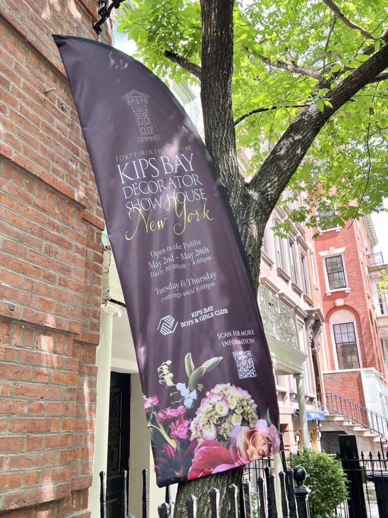
The interior design event of the year, the Kips Bay Decorator Show House isn’t just about drool-worthy design, although there’s definitely plenty of that!
It’s actually a long-running Manhattan charity event with a big heart. Founded in 1973, it all started as a way to raise money for after-school and enrichment programs for kids in New York City.
Every year, they pick a luxury Manhattan house and turn it over to a team of superstar interior designers. These design gurus create dream rooms, showcasing the latest trends, and visitors flock to see their creations.
Over the years, the Show House has become a major design event, and more importantly, it’s helped countless kids through the Kips Bay Boys & Girls Club.
There is now also a Kips Bay Show House in Palm Springs and as well as in Dallas. Guess what is getting added to my bucket list!
What is the history of the Kips Bay Showhouse?
The interior design event of the year, the Kips Bay Decorator Show House isn’t just about drool-worthy design, although there’s definitely plenty of that!
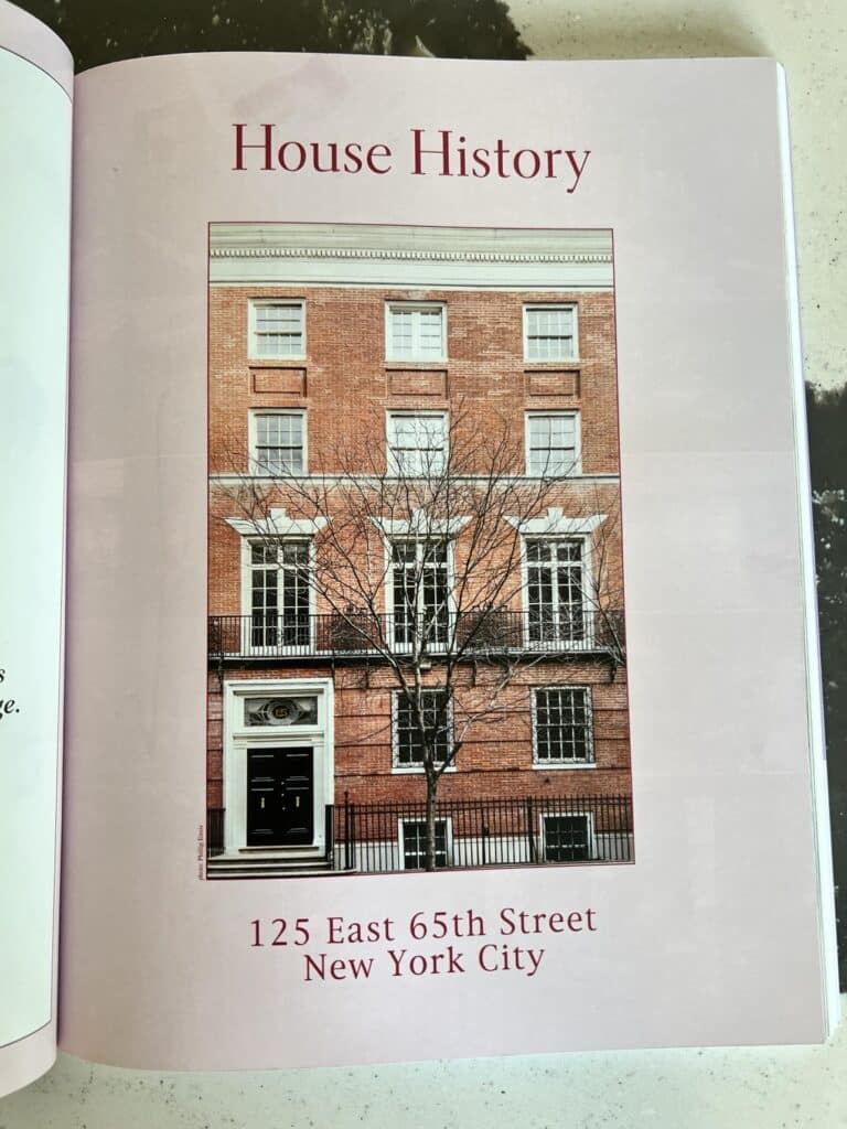
This townhouse has some serious history! Built all the way back in 1904, it was designed by Charles Platt, a famous architect who also did houses for the Roosevelts and Astors. You know, those fancy folks!
It’s actually a long-running Manhattan charity event with a big heart. Founded in 1973, it all started as a way to raise money for after-school and enrichment programs for the kids in New York City.
Every year, they pick a luxury Manhattan house and turn it over to a team of superstar interior designers. These design gurus create dream rooms, showcasing the latest trends, and visitors flock to see their creations. Over the years, the Show House has become a major design event, and more importantly, it’s helped countless kids through the Kips Bay Boys & Girls Club.
There is now also a Kips Bay Show House in Palm Springs and as well as in Dallas. Guess what is getting added to my bucket list!
You can find more details on the history of this annual show house HERE.
The Merry Month of May for Design Lovers
This year’s New York show house is running through the month of May, 2024. The iconic Upper East Side townhouse at 125 East 65th Street (not to be confused with the Upper West Side!) plays host to the extraordinary talent of twenty-four talented designers and architects.
They transformed the historic space into a showstopper, featuring a range of design styles across its five floors.
From May 2nd to May 28th, design lovers can flock to see the latest trends come to life, all while supporting the Kips Bay Boys & Girls Club.
The Kips Bay Decorator Show House New York
To say I was overwhelmed is an understatement!
So many rooms!
There is so much to take in!
So much to tuck into my inspired brain!
Sometimes I was so overwhelmed that I forgot to take a photo. Oops!
However, I do have a few snaps of my favorite and most intriguing rooms.
Be sure to read to the end of the post to see my FAVORITE room!
We stepped into the front door entry (with amazing light fixtures!) and turned the corner into a kaleidoscope of color, texture, and whimsical sophistication!
This was my first clue that this annual celebration of design was going to feed my maximalist soul!
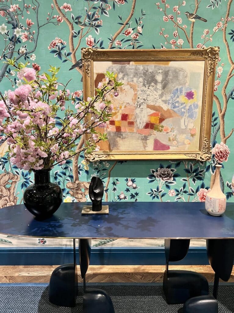
The brochure titled this room “Old Guard/Aavant-Garde” and I think the name is perfect!
Designed by Anne Pyne and Elizabeth Pyne Singer of McMillen Inc., this living room built layers of color with both traditional and modern elements.
The chinoiserie wallcovering provided the perfect color palette for the kidney-shaped upholstered stripe sofa and the turquoise blue and scarlet red curtain panels.
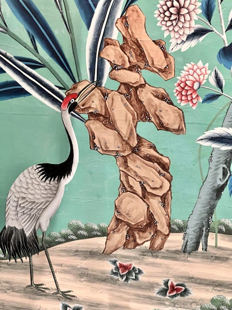
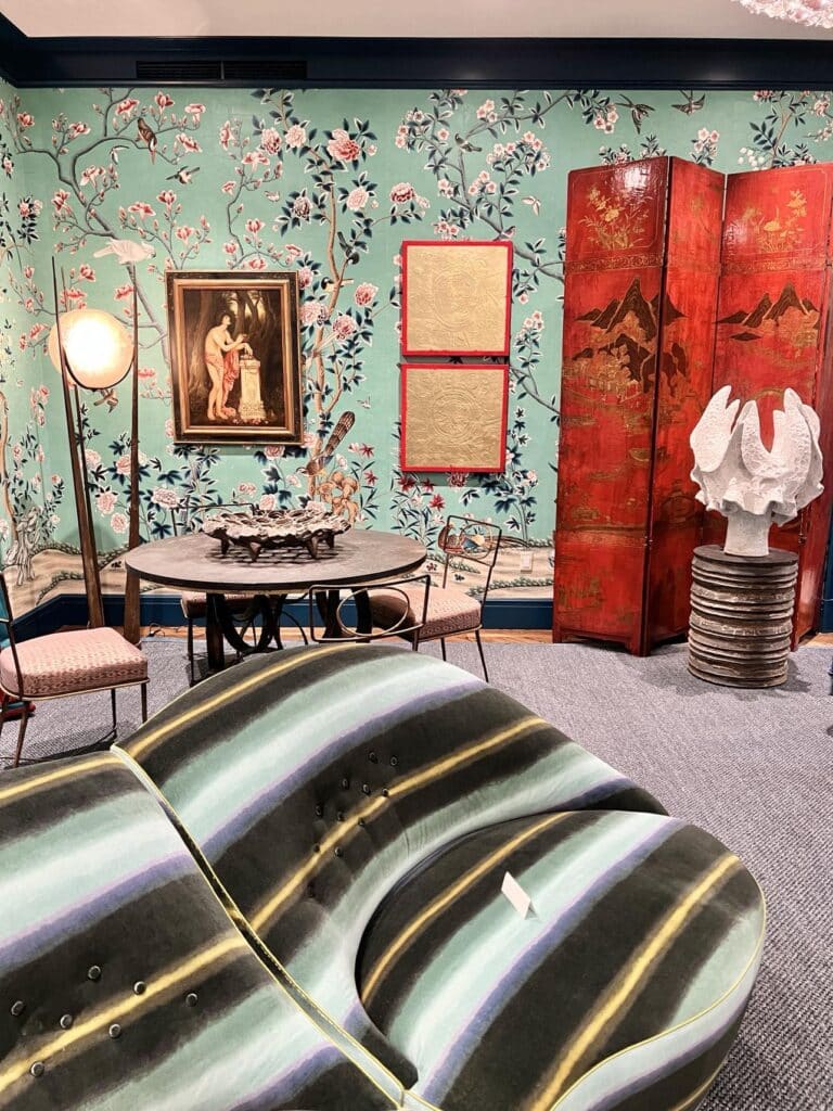
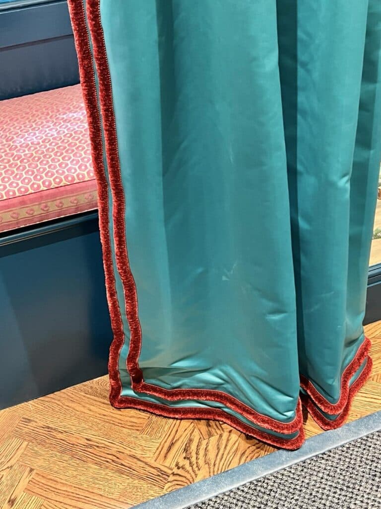
Perhaps most interesting (and dramatic!) were the sculptural elements in the room.
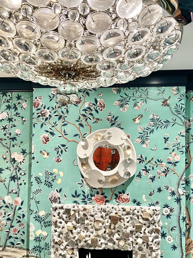
From the circular mirror above the fireplace to the glass disk light fixture, there was a feeling of movement and energy in the room that was exciting and invigorating!
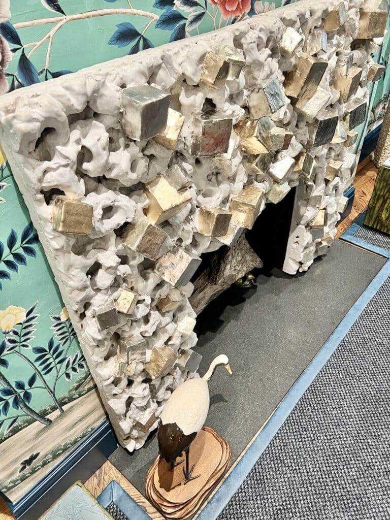
Speaking of the fireplace…talk about a focal point!
The chunky silver and gold blocks were embedded amidst chalk-white circles and drew you in to look closer. With everything else going on in the room, the fireplace grabbed your attention and held it!
Stairway to Heaven
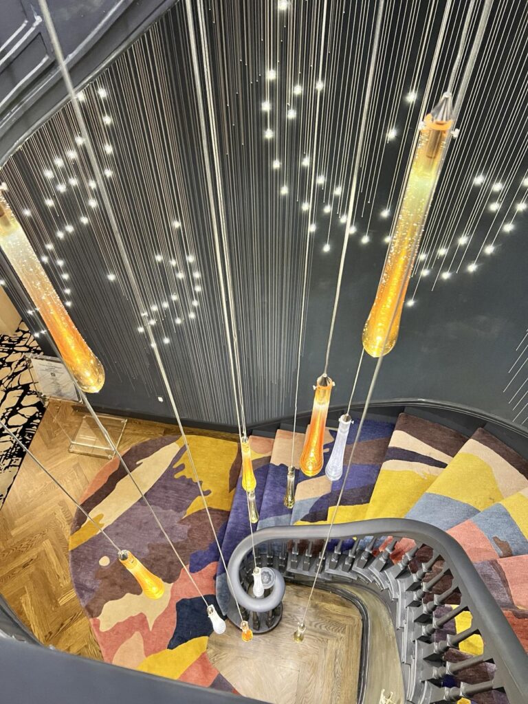
Before I go any further, I must talk for a moment about the spiral staircase. Designed by Swati Goorha Designs, the winding staircase takes you to all 5 floors of the home. The dark moody walls twinkle with wallpaper containing embedded LED lights that lead the way from floor to floor.
Hanging from the ceiling (a very tall ceiling) were dangling lights in both clear and colored glass. The vibrant stair runner rug grounded each stairway curve with bold colors that were reflected in the lights.
Oh, and then the color palette morphed as you went from floor to floor. Hence the name of the space “Metamorphosis: A Journey of Transformation.”
Walking so many flights of stairs has never been so much fun!
The Club Room
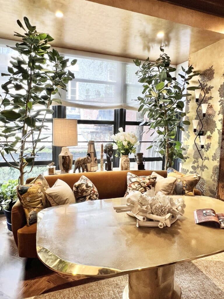
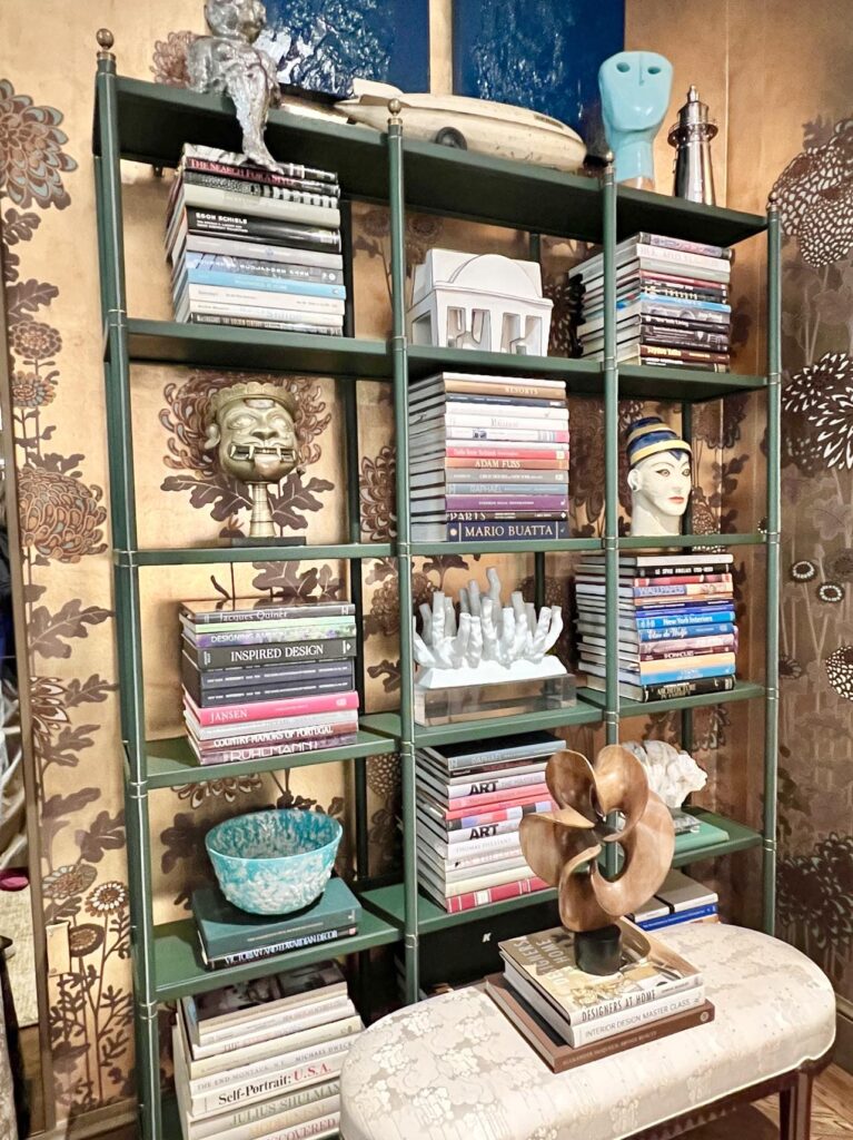
The club room, designed by Alan Tanksley, is one of my favorite rooms. The room positively glows!
The wallpaper, with gold tones swirling in a mesmerizing dance, morphs from pure gold to copper to verdigris depending on where you stand in the room. It is magical!
A sumptuous toffee-colored sofa flanks a unique gold table, positioned perfectly to take in the view from the window-filled wall.
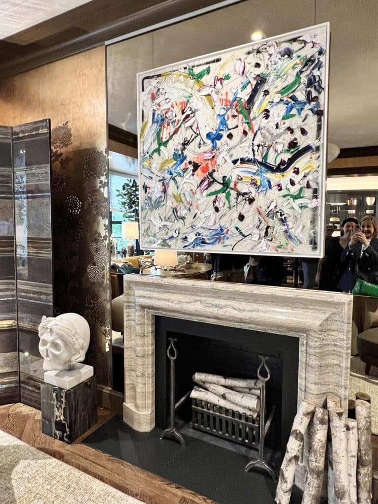
Above the cool marble fireplace, a colorful abstract work of art in bold hues adds a jolt of energy.
The room’s true treasures line the bookcases – not just the collection of gorgeous art and design books, but the sculptures, busts, and bowls. They look as if the dweller has traveled the world to add to the collection…each whispering stories of faraway lands!
The Kitchen
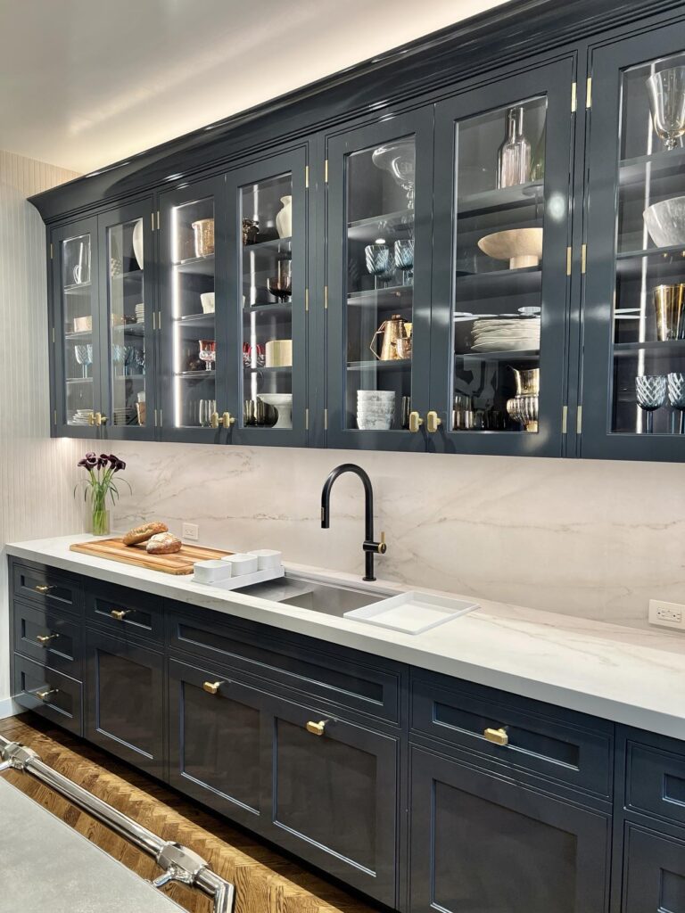
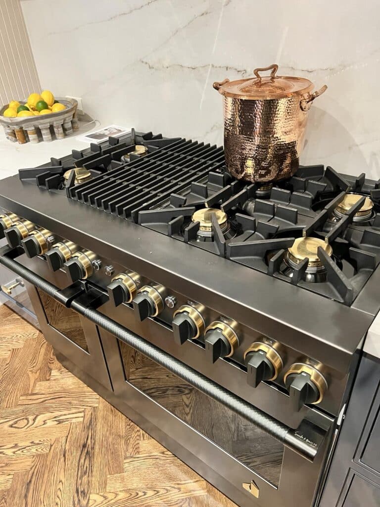
While not a large space, this classic kitchen designed by Karen Williams of the design firm St. Charles New York, has the most beautiful finishes!
From the Kohler sink and faucet to the Jennair appliances to the saturated Benjamin Moore paint, this kitchen is extremely functional and oozes culinary style with every surface!
Layers and Texture
One of the design themes I noticed throughout the show home is that of layers and textures. So many rooms contained elements that were given a layered or 3-D effect to give dimension to the room or individual piece.
A good example of this is the bar designed by Michelle Gerson Interiors.
Of course, this bar contains all of the glamorous crystal barware, wine glasses, and champagne flutes on floating metal and glass shelves that you might expect.
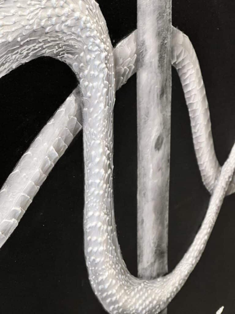
But look closer and you will see the daring face plates, the whimsical bowl of golf balls in a glass bowl, and….is that a snake you see on the wall behind the shelves?
Why, yes it is!
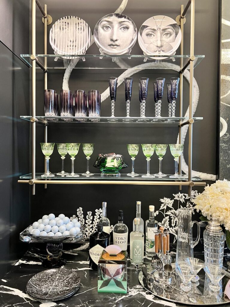
This handpainted wallcovering showcases a winding, meandering snake featuring amazing sculpted plaster scales!
The artistry is incredible! It looks SO real!
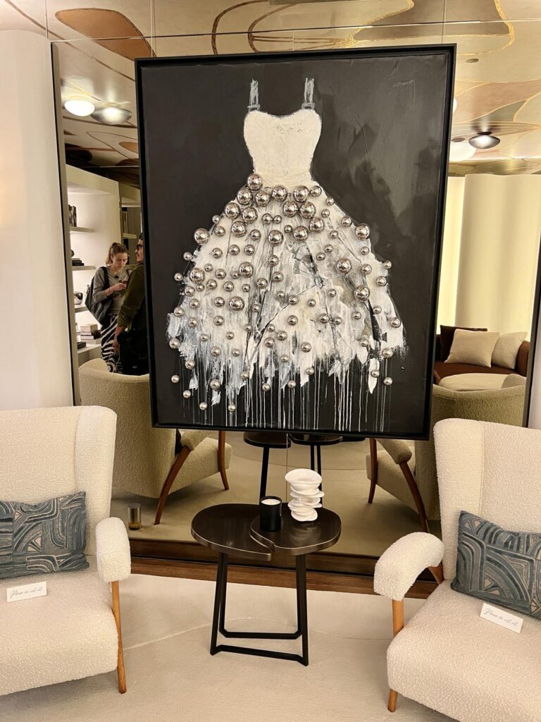
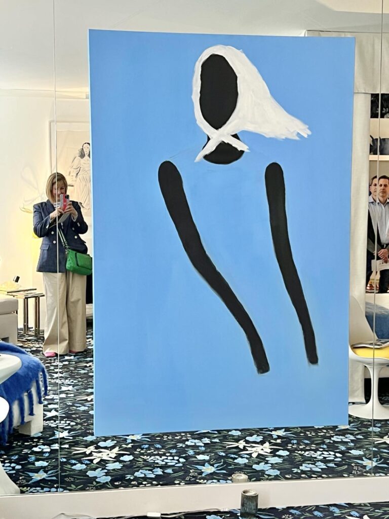
Another example of layering is this art piece that is featured in a room titled “Le Fumoir Féminin” (It literally means the Feminine Smokehouse!) designed by design company Workshop/APD.
This room does not have a hard edge anywhere. Rather, all the furniture, accents, and even the wall are curvy. I would love this space for a dressing room! Notice the beautiful silver baubles hanging from the skirt of her beautiful party dress!
The dimensional baubles layered on the artwork that is layered against a mirrored wall beautifully reflect the feminine curve of the room’s walls on the opposite side of the room.
This and That
Here are a few more photos of rooms and vignettes that caught my eye…
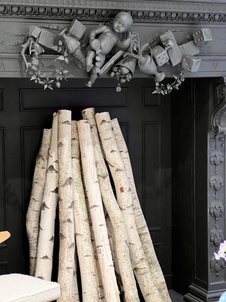
I walked into this room and was immediately drawn to the birch logs arranged vertically in the black fireplace. Oh, how I wish our fireplace had this height to spare!
The fireplace mantel itself also has a few visual surprises in store! It might not be for everywhere but you have to admire the commitment to drama!
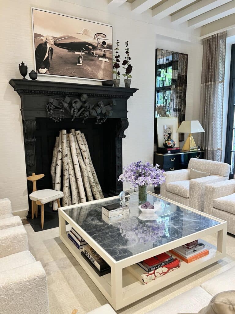
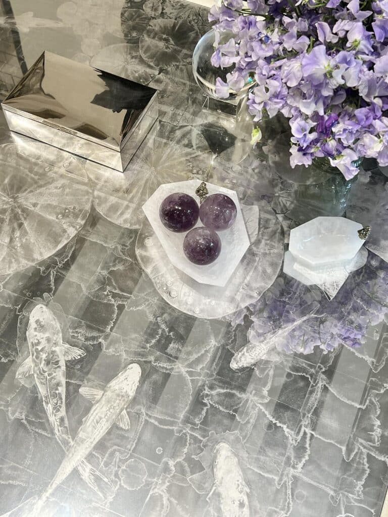
And can we take a closer look at the gorgeous coffee table in front of the fireplace?
The fish at the top of the table look like they could be swimming underneath the “water’s surface!”
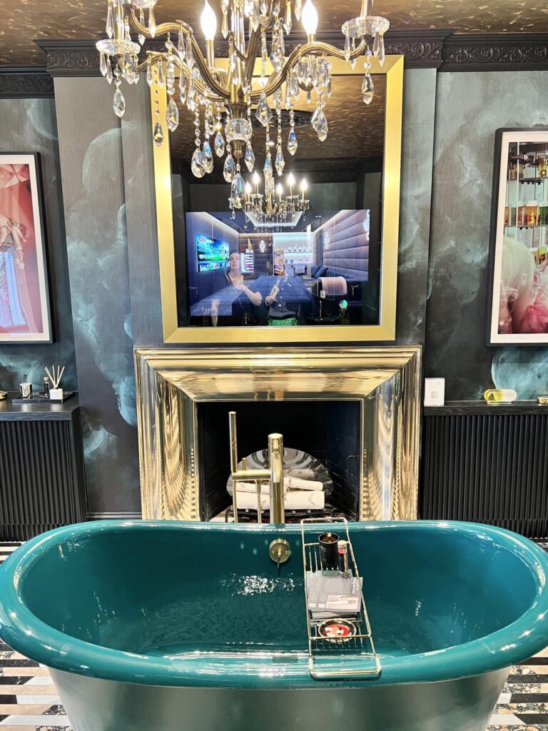
In the room, all I would need is a glass of wine, bubbles…and a guard at the door so no one walks in on me during bathtime!
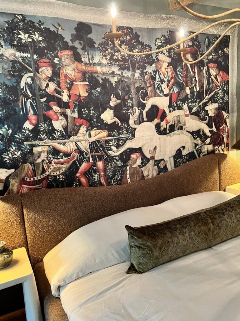
This bedroom design features a minimalistic bed so all eyes are drawn to the wall’s English countryside scene.
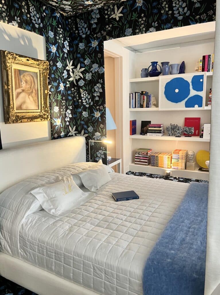
Framed Renoir and blue poppies make excellent bedfellows in this bedroom!
My Favorite Room!
While each room of the Kips Bay Show House gave me a thrill, my absolute favorite room in the house is the dining room!
My jaw dropped the moment I entered the room…and I don’t think I ever closed it! (Don’t tell my mother!)
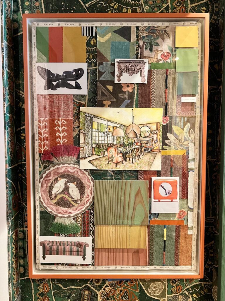
Designed by the Kit Kemp Design Studio, this room instantly had my heart. Before we dive into my photos (and I have a few…), take a look at this fabulous mood board.
Here is my view as I walked into the room…(did your jaw drop too?)
The light fixtures!
Oh, the table setting!
Ooh, the painted architectural details in the wall mural!
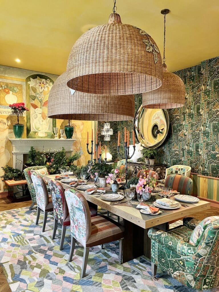
I stood there for a moment to try to take it all in before diving in closer to see some of the sumptuous details.
Let’s Talk Chairs
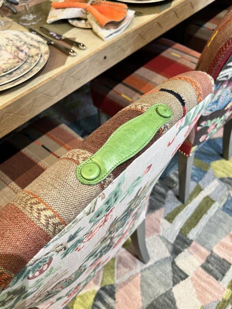
While the front side of each chair uses a colorful stripe fabric, the backs of the chairs shake things up with a variety of lovely floral prints.
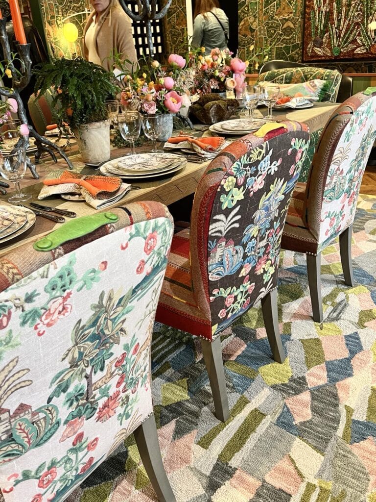
The icing on the cake is the leather pull and buttons attached to the top of each chair! (I’m definitely taking this idea home!)
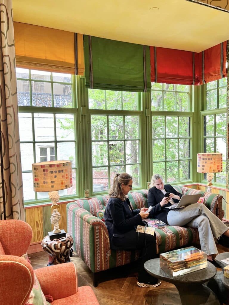
To one side of the dining table was a seating area with window valances…each in a different solid color pulled from patterns in the room.
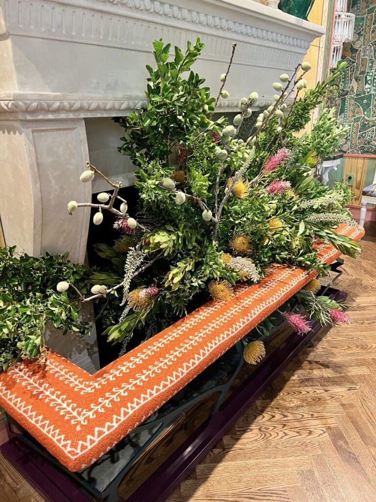
In front of the fireplace sat an upholstered club fender with bountiful flowers displayed behind it. (If you are wondering, a club fender is a comfy, upholstered seat that curves around a fireplace hearth, offering a warm spot to perch and enjoy the fire.)
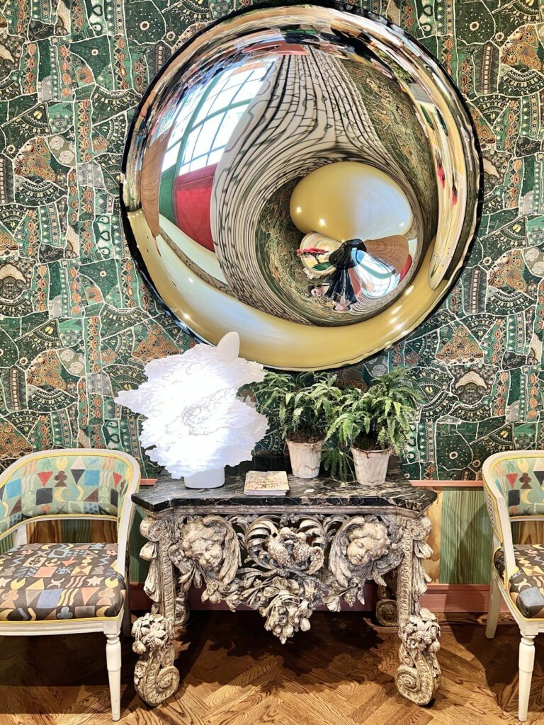
The mirror on the other side of the room gave the space glamorous “funhouse” vibes that played with the colors of the room as you moved.
The Tablescape
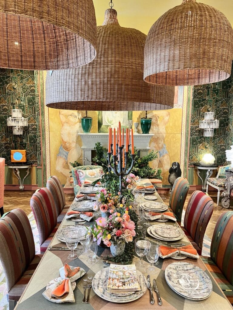
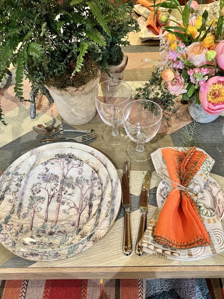
Lush with colorful flowers, airy potted plants, antler candlesticks, and pops of orange through the cloth napkins and candles…the table setting is formal and elegant but oh so welcoming and inviting!
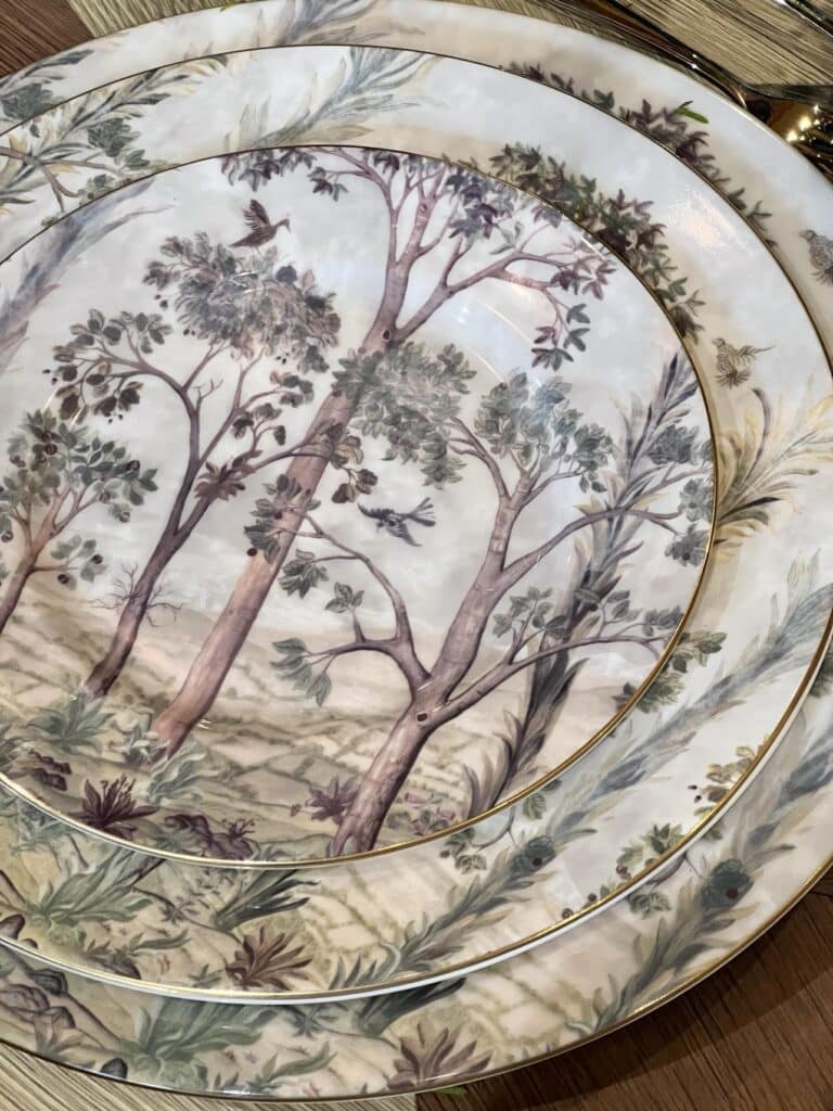
The layered Spode dinnerware called “Tall Trees” is a design by Kit Kemp herself and is in one word…Stunning!
I know I have too many dishes at home but this glorious pattern is on my wishlist! (Ask my family…I have a thing about trees!)
Someone give me one salad plate and an easel and I will be over the moon!
So Long Show House, Hello Home Sweet Home (Makeover)!
So, that’s a peek into the world of this year’s show house! These spaces are a true testament to the incredible talent buzzing in the design world.
I hope it sparked some inspiration for your own home!
Remember, even the most show-stopping rooms started with a spark of inspiration. So, let this be your nudge to get creative! Whether it’s a bold paint color or a quirky object that catches your eye, embrace what makes your home unique.
After all, your space should be a reflection of YOU…your own heart of creativity. Now get out there and decorate like nobody’s watching (except maybe us design enthusiasts!)
Do you have a favorite space from my Kips Bay Decorator Show Home Tour? Please tell me in the comments! I would love to hear your thoughts!
Cheers!

Don’t Forget to Pin It!
Pin the image below to your boards on Pinterest (just click the Pin button in the top left corner). You can also follow along with me on Pinterest!
SHD Rooms I Love to Share
Bold and Beautiful Half Bath Makeover
Be Our Guest: A Colorful Guest Room



That would be my favorite room too!! So many fun colors and I’m obsessed with the lighting!
Aren’t those light fixture AMAZING! I wish you could have been there with us!
Oh my goodness Missy! This is absolutely fabulous. Thanks for bringing us along. I want to redecorate my whole house. lol. XO- MaryJo
Hi MaryJo! Show homes always give us inspiration, don’t they!